Brief:
Using only an image of a light bulb, the word ‘light bulb’ and a block of colour of your
choice create different designs that explore visual dynamics.
Requirements
- Create 20 designs that explore visual dynamics
- Use only the image of a lightbulb, the word lightbulb and a block of colour of my choice
- Think about composition, layering, hierarchy and contrast
- Use thumbnails to work out what sort of designs I might try
- Be playful within the rules set
Analyse The Brief
Short and long-tail keywords
Lightbulb, colour, composition, layering, hierarchy, visual dynamics, arrangement, visual elements, pull and push, colours can produce energy, vibrate, focus on key elements, sense of depth, level of priority, viewers eye travels, directing them to look at key information, before the less important details, easily done with typography, contrast, seeing the light.
What do I think I am being asked to do?
This exercise is to do with visual dynamics and I am to create 20 different designs with the use of 3 elements – a lightbulb, the word lightbulb and colour of my choosing. I am to take into consideration the dynamics of the design by looking at different ways that I can create energy by arranging my visual elements in different ways. I am to focus mainly on the energy of the design, the composition or ‘layout’ of design elements, layering to create the feeling of depth in my design and how I can direct the viewer’s eyes to see key information first through the hierarchy. I am also asked to become aware of how I look at things and try to understand how I have constructed the visual dynamics in my own work.
Communication issues, design problems and other concerns
- How can I get a better understanding of the terms composition, layering, hierarchy and contrast?
- How will I make sure to create different designs that put the focus on each element as the main feature of the design? I.e Image of lightbulb, the word lightbulb and a block of colour?
- What will I start looking at around me to understand how different designs are constructed?
- What research do I need to carry out for this exercise?
- What colour will I choose?
- What tools will I use to create my designs?
- Who will critique my work?
- What changes will I make based on my feedback?
- How will I display my design work to the client?
How will the client judge a successful outcome to the brief?
The client will judge my designs successfully if I stick to the brief and follow the requirements. As long as I show that I understand the terms composition, layering, hierarchy and contrast and they are clearly displayed in my design work. Then the client should mark my work as successful.
Researching And Developing Ideas
To start my research I first want to fully understand the visual dynamics that are going to make up my design.
Composition
What I already know about composition? Composition is the layout of a design and how all the design elements appear next to each other. Composition is something we use when we want to focus the viewer’s eyes on a certain key element within the design. Pretty much to get the viewer to look at something that you want them to look at.
Using composition for my design work I will need to arrange my visual elements in a way that is visually appealing, but try and focus on one element at a time for each design i.e image of a lightbulb, the word lightbulb and a block of colour.
I had a look online and read a few articles to better understand the term composition and how it is used in design –
“Composition is the arrangement or placement of visual elements in a piece of artwork. You might consider this exactly the same as the “layout” of a piece(a term you hear a lot in graphic design)”. (1)
“This is kind of an abstract concept so let’s clarify: composition is NOT the actual subject of your art, but where you put it“. (1)
“Composition is important because it shapes the viewer’s experience of the artwork.” (1)
“If there’s more than one focal point, how are both points laid out on the page? How does that direct your eye? How does the composition affect the feeling of the piece?“ (1)

“This is why it’s called the rule of thirds.“
“You see the areas where the lines intersect? According to the rule of thirds, those are the most interesting areas to put your focal point(s) for balance and harmony.” (1)
“10 Rules of composition that designers swear by” (2)
- Find Your Focus
- Direct the Eye With Leading Lines
- Scale and Hierarchy
- Balance Out Your Elements
- Use Elements That Complement Each Other
- Boost (or Reduce) Your Contrast
- Repeat Elements of Your Design
- Don’t Forget the White Space
- Align Your Elements
- Divide Your Design Into Thirds
Here is design I found on the cover of Vogue magazine with great composition –

- I like the composition of this image and the mix of colour, image and typography
- I especially like the fact the model is in front of the heading as it gives a sense of hierarchy in the design
Layering
What I already Know about layering? I am quite clued up on this term because I tend to use it when taking photos with my camera. I get something close up to the lense so it goes out of focus, but leaves whatever is in the distance clear and in focus. Having something close up and out of focus moves the viewer’s attention to what is in focus. I also use the layering technique when I want to add depth to my photo for example when I am taking photos of rolling mountains, I like to take the photo when the sun is low because it creates a different shade for each mountain creating a beautiful layering effect.
Here are a few example photographs that I have personally took with depth in them.


I personally like these photographs because there is an element of depth, and with me blurring out objects close to the lense, it stops the image looking flat and in return gives a nice layering affect.
Below are a couple of photographs I took of a mountain range in Germany, creating nice layers.


I am quite confident I know that the word layering means in graphic design. Creating layers in a design will direct the viewer’s eye either outwards or closer depending on the objective of the designer but where ever the focus goes, the viewer’s attention goes.
After searching on the web for examples of layering, I came across a couple of designs that use transparency as a form of layering.
I like the example above as it adds depth in a different way to what I originally imagined. I especially like the image 2nd bottom from the left. I wonder If I could replicate this design by making the word lightbulb transparent and behind it have the lightbulb image or vice versa.
I wanted to get a few more examples of different designs with a layered effect. I thought by doing this will give me some ammo to use while sketching. See below for my findings.

- I like this image as hierarchy has been used through the use of layering.
- The design puts the focus on the letter A as the most important element and then the alphabet as the second.

- These examples show the use of double exposure, another style of layering in design.
- I like these designs as I feel they add an element of emotion and tell a story within the image.
Hierarchy
What I already know about the term hierarchy? Before this exercise, I wasn’t sure what this term meant to so I had to read the exercise clearly and jump online to understand the term better. Now, just typing what I know out on my screen, I believe that hierarchy in design means directing the viewer’s eye to key information. Hierarchy is something I need to think about when I am designing so what questions could I ask myself to better understand the concept?
- What element in my design is most important?
- What is the key information in my design?
- Can I use typography to grab the viewer’s attention?
- What do I want the viewer to see the first time they look at the design?
- How will I direct the viewer’s eye to the most important element of the design?
These are interesting design problems that I will consider in the design stage.
I wanted to go deeper into the term hierarchy so I jumped online and had a read through some interesting articles about hierarchy in graphic design –
“Hierarchy is the control of visual information in an arrangement or presentation to imply importance. Hierarchy influences the order in which the human eye perceives what it sees.” (3)
In design, hierarchy is used to: (3)
- Add structure
- Create visual organisation
- Create direction
- Add emphasis
- Help a viewer navigate and digest information easily
“Hierarchy is typically created by contrast between visual elements in a composition. Typically visual elements with highest contrast are noticed first. Using hierarchy we can control how a viewer engages with information to ensure that information is navigated and digested in the way it is intended. For example: Where do we want the eye to look first, second, third and so on.” (3)
Hierarchy In Scale
- Importance starts from top
Hierarchy In Colour
- Importance starts from bottom
Hierarchy In Scale
- Importance in the larger objects
Hierarchy In Colour
- Importance in smaller object
Hierarchy In Depth
- Importance in shape that appears most clear

Above is an amazing infographic that easily describes what hierarchy is in a visual way. The before and after examples gave me an absolute laser focus on what hierarchy means. It brings a design to life and improves the composition of the design by making it look neater and more visually appealing to the viewer.
Contrast
What I already know about contrast? I feel like the term contrast goes hand in hand with the term hierarchy because we typically add contrast to a design to establish it’s hierarchy. In other words we add contrast to a design to show an object’s importance. It is another way to attract the viewers eye to the most important element within the design. For example, a dark image with white text over the top makes a nice contrast.

Below is an image I found online that gives a nice example of contrast in an image.

“This webpage layout features contrasting color temperatures with bright shades of blue and yellow. This helps both the call-to-action button and the main image stand out particularly well. Plus, because both of the colors lean in a cooler direction (with a greenish tinge), the combination has a cohesive look even though it’s very high-contrast.” (4)
“A layout where everything is the same size, shape, or color is going to look pretty boring—but contrast spices things up.”
“However, as with most design concepts, contrast should be applied in a balanced way; too much contrast can be just as bad as none at all and may result in a confusing or visually jarring design. If all your design elements contrast, nothing will stand out.”(4)
Visualising Your Ideas
At this point, I feel like I have a better understanding of the terms composition, layering, hierarchy and contrast and I am confidently ready to put what I have learnt into action. These terms are probably the most important aspects for a graphic designer to consider when sketching out ideas. I am going to start in my sketchbook and see what I can come up with, see what different styles of composition I can attempt, how many ways can I use layers to bring depth to my design, what I can do to create hierarchy in the image and make important objects stand out and how I can create visually appealing designs that show nice contrast.
Sketchbook


Design Work
For my design, I was allowed only to use the image of a lightbulb, the word light bulb and a single colour of my choosing. I was asked to create 20 different designs only using these 3 elements and with the terms composition, layer, hierarchy and contrast in mind, I wanted to attempt each of those terms in a design. Below I have put all my designs onto a single artboard but then underneath that, I have organised each design into a different category. For each category I have established the hierarchy for each design so to start with, I have created 6 designs that establish the word ‘light bulb’ as the hierarchy. Next, I have created 5 designs that establish the colour as the hierarchy of the design. Then I created 6 designs based around the image of a lightbulb being the hierarchy of the design and lastly, I created 3 designs to demonstrate a nice composition across each design. Underneath each design is a bit of information explaining what I did.

Word
For this section, my aim was keep great composition but to add importance to the word ‘light bulb’.

- I turned the light bulb into 2 objects so that I could lower the opacity of the glass without affecting the screw
- I enlarged the word to show it’s importance
- I removed the fill to give a nice contrast of colours, I thought too much black would make the bulb stand out too much taking the hierarchy away from the word

- I went for a nice font called Cooper Black to make the design more visually appealing
- I brought the word in front of the bulb to show its hierarchy
- I removed the fill to keep nice composition of each element

- I moved the bulb down showing only the top so the viewers attention would go straight to the word
- I put the word on top of the yellow card to help it stand out

- I aimed for a nice composition with this design by ‘shining a light’ on the word light bulb

- I went for different angle to the design above but this time I am using the light to hold up the word, clearly showing the word light bulb as hierarchy

- I used my own personal photo as inspiration for this design
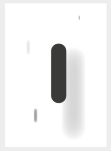
- I blurred out the image in the foreground to add depth and give importance to the word light bulb
Colour
My focus here was to add importance to the block of yellow colour and to show it’s hierarchy on the design.

- I attempted to fill most of the design with colour but kept a nice composition by keeping the words and light bulb the same size
- The colour is a ray of light coming out of the bulb, adding a beautiful element of what the design is attempting to communicate

- I went for a nice composition for this design by carefully choosing where to place each element

- For this design I had in mind an album cover and by keeping the word and image at small scale, will draw attention firstly to the colour

- I only added half the light bulb and tucked the word down in the left corner to add importance to the colour

- For this design I attempted to fill most of the design with colour to show its hierarchy
Light Bulb
For this section, I made sure to enlarge the light bulb to shows it’s hierarchy of the design.


- For these designs I wanted to see how many positions I could put the light bulb without taking away it’s hierarchy
- I was happy with these designs as a feel the composition is on point for each
Composition
For these designs, I focused mainly on the layout and composition. I didn’t so much want there to be a hierarchy in the design but for each design element to have as much importance as the others.

- For this design I removed the letter I and replaced it with the light bulb image
- I improved the language to the design by adding a circular block of colour around the light bulb portraying a ray of light.

- Here, I slotted the light bulb image into the letter U to add some fun to the design
- I filled up the whole page with yellow to make the other elements stand out

- Going for nice composition again and adding an element of fun here
- I attempted to make this image life like by making the light bulb image look as if it is hanging down from the roof
Reflection
Going into this design I knew I would have to do a bit of research and learning for a couple of the terms explained in the project part of the exercise. I was excited to learn though because I have heard the terms composition, hierarchy and contrast before and always subconsciously wished I knew what they meant but never really had an excuse to look them up, until now.
At first, I thought how would I possibly create 20 designs using only 3 elements but only after learning the terms composition, layer, hierarchy and contrast were I able to open up my mind to more possibilities and explore different layouts for each design. I surprised myself with how many designs I could come up with and to be honest, I got to 20 and couldn’t stop so, in the end, I had to make a few cuts, but going from not knowing how it was possible, to being blown away by how many designs I could come up with. I feel like I covered each term nicely in a nice selection of designs.
I loved this exercise as I went from not knowing anything about each of the terms to now having a great understanding of how a design is made up! A great design would need a nice composition of elements placed in a way, that is pleasing to the eye and a nice contrast would make certain elements stand out more than others. Another amazing way I found that adds importance to an element on a design is the term hierarchy. This term establishes the importance of a certain element on a design, an element that draws the viewer’s attention to the design and then it’s up to the composition of each element, contrast and image as a whole to keep the viewer’s eye on the design.
I decided to go for my fave font ‘Cooper Black’ as this font has been around for 100s of years and used for all kinds of different designs, I think it is a beautiful font and brings the design to life.
I went for yellow as my colour choice. I decided this because I thought about the colour a light bulb produces and thought if I used yellow that my designs would communicate a better language as the 2 are related. I found this colour by going to adobe colour and searching for a light bulb colour palette.
Since this exercise, I will never look at a design the same again! I love how my mindset is changing as I go through this course and I am becoming more and more aware of the world of graphic design around me. I find myself seeing certain designs in the street and I find myself trying to break the design down by establishing the importance of each element and what language the design is trying to portray. I have found myself doing this, especially with company logos. I have been trying to crack the codes on what a logo means for the business and what the logo is trying to communicate. I was mostly attracted to the company FEDEX recently and wanted to learn the language of their logo, so I researched and found that there is a hidden arrow in between the E and X. I was blown away because I never saw it before. The arrow is almost like an optical illusion and I learnt that the arrow symbolises moving forward and innovative. I am reflecting more on my last exercise about symbols here but I think it goes hand in hand with designs, how they are laid out and also shows different ways my visual skills are improving in the real world.
Not only are my visual skills improving, but my technical skills are improving also. This exercise allowed me to spend a lot of time exploring Illustrator and the tools that go with it. When starting my design work I realised that I had a few gaps in my Illustrator knowledge but to solve the problems for each I made sure to learn the necessary skills required. Please see ‘research’ and ‘design notes’ below to see a few new skills I had to learn to get some of the designs I visualised. At the same time as doing this course, I am also doing an Illustrator course and by the end of it, I hope to become a certified Illustrator professional. Every time I learn something new on the Illustrator course I get to try it out for each design I create during this course which is very exciting.
I followed the design process steps below:
- I received the brief
- I analysed the brief and highlighted key points
- I found some communication issues and design problems
- I researched and visualised ideas
- I am still awaiting feedback from the OCA community
- I finalised my artwork
Going forward I would like to focus more on the composition of my design work and make sure to clearly establish what element is most important and how I can keep the viewer’s attention on the design. To first bring the viewer in, I think my future design work will need to have a beautiful contrast of colours and a great composition of elements that are enough to keep the attention of the viewer.
One area in particular that I struggled with and want to work on in the future is alignment and finding the centre of each element and placing it on the artboard accordingly. To achieve this I need to learn how to use grids and rulers.
Critique
I asked the Graphic Design community for feedback, the conversation went as follows –
“Hey team,
Hope you are doing well!
I have just completed my design work for Seeing The Light and was wondering if I could get some feedback.
I have tried to establish the hierarchy for each design. Some of the designs focus on the light bulb image, some designs focus on the word light bulb and lastly colour.
What is your fave design and why?
Thanks so much,
Stephen”
Replies
“Hi Stephen,
4th across, 3rd down – how about making the letters yellow and fill the shape of the triangle?
Just an idea.
Ros”
“Hi Stephen
I am a fan of the top right image with the hanging bulb.
I like the fact it is paired back and allows everything to visually do its job nice and clearly.
The yellow line /cord grabs the eye and then pulls it down into the image and text, nicely done.
Good stuff mate
Andy“
“I like this concept – I think it gets across the concept of shedding light on an idea really well, also it is aesthetically pleasing and very ‘graphic’ to me.
Thanks for sharing!
Great work!
Heidi“
“Hi Stephen,
I am not by this assignment yet, but my favourites are the very first one on the top and the third one underneath it with the yellow circle around the light bulb. I like the idea of using bold typography on the first one, and on the third image, the light is shown as a circle, resembling the Sun. I also like the colour choice of your images.
Angela“
Notes on feedback
I am happy with my feedback and personally feel like I have achieved a happy crowd, so I don’t feel like I need to change anything this time.
Bibliography
Composition – (1), (2)
Hierarchy – (3)
Contrast – (4)
Research
- How to turn text into outline in illustrator?
https://www.shutterstock.com/support/article/converting-text-to-outlines- I used this to turn my text into a path so that I can see objects underneath
- How to find middle of artboard illustrator
- How to blur an image in illustrator?
Design Notes
- Lightbulb
- I broke the down the lightbulb into individual parts so that I could turn down the opacity on the glass and insert a block of colour behind it.
- Saved sun colour on adobe colour
- Block Of Colour
- I recently learnt how to resize an object to fit artboard, this really helped me neaten up the design i am working on
- Text
- I learnt how to turn text into an outline so I can remove the fill and place an object behind
- Artboards
- I learnt how to arrange
- Blur
- I learnt how to blur an image in the foreground to add an element of depth and show the importance of an element in the background
