Brief:
“Draw two grids of squares, filling one with colours that you like and the other with
colours you dislike. Then put the two grids side by side and ask the question ‘which one
looks better?”
“Try and find different combinations of two colours to illustrate each of these ideas:
- Angry
- Brave
- Creative
- Dangerous
- Energetic
- Familiar
- Gregarious
- Hopeful
- Independant
- Jumpy
- Kinetic
- Luxurious
- Masculine
- New
- Open
- Precious
- Quiet
- Reasonable
- Sociable
- Tasteful
- Unhappy
- Vital
- Wonderful
- Extra
- Special
- Youthful
- Zany”
Requirements
- Draw two grids of squares
- Fill one with colours that I like
- Fill the other colour with colours I dislike
- Put the two grids side by side and ask myself the question ‘which one looks best’
- Use bright colours and balance them against more subtle colours
- Understanding colour swatches on DTP software, how to select them and how to blend the colours by changing the opacity
- Find different combinations of two colours to illustrate each of these ideas – Angry Brave Creative Dangerous Energetic Familiar Gregarious Hopeful Independent Jumpy Kinetic Luxurious Masculine New Open Precious Quiet Reasonable Sociable Tasteful Unhappy Vital Wonderful Extra special Youthful Zany
Analyse The Brief
Short and long-tail keywords
Exploring how colour works, dynamic relationships between colours, garish, jarring, contrast, subtle, muddier mixed colours, tertiary colours, bright hues, balanced, colour palette, colour swatches, blend colours, opacity.
What do I think I am being asked to do?
The overall objective for this exercise is to understand colour and how certain colours when mixed together create new dynamic relationships. I am to demonstrate the difference between colours I like and colours I dislike by putting them next to each other to see how they balance out. I am also being asked to find different combinations of two colours that represent each idea demonstrated in the brief.
Communication issues, design problems and other concerns
- What colours do I like?
- What colours do I dislike?
- How many experiments will I carry out to display a nice array of colours?
- What research will I carry out to find examples of nicely balanced colours?
- What colours will I mix together to find tertiary colours? Primary and secondary?
- What bright hues don’t I like?
- What software will I use to create the grid? Illustrator?
- What research will I carry out that will teach me how to successfully make full use out of the colour swatches in Illustrator?
- How will learn to blend colours by changing the opacity on illustrator?
- When will I know that I have successfully grasped the idea of this exercise?
- What research will I carry out to find two colours that illustrate each idea in the brief?
- What will I reflect on to show that I have grasped the concept of ‘understanding colour’?
- How will I self evaluate my own performance in this exercise?
- What information will I carry forward and use in future exercises and assignments?
How will the client judge a successful outcome to the brief?
- To see a balance of colours I like and colours that I dislike through several experiments
- To see a wide variety of colours that closely represent the ideas demonstrated in the brief
Researching And Developing Ideas
How many colours are there in the world?
What are the main colours?

To start this exercise I thought to myself what kind of colours do I like and what kind of colours do I dislike. I contemplated on this throughout the day and as I was driving around, I noticed the sky and how beautiful it was but it was also later in the day so the sun was low. The sky was a nice blue colour but because it was getting late I noticed all the vegetation, bushes and trees started to look a dark muddy colour. This made me realise how much I love the blue sky but how much I don’t like the muddy brown colour when vegetation is in shade. It’s quite an eerie colour and not so pleasing to the eye.
I decided to take this finding and put the two colours into a grid and see how they would look and then try and match the grid with one of the terms.
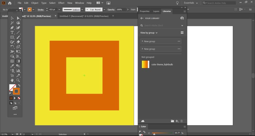
I created the grid using Illustrator. The steps I took to achieve this were as follows:
- Create square artboard
- Blue box to fill the artboard
- Another box created and fill removed
- Stroke increased to 433pt
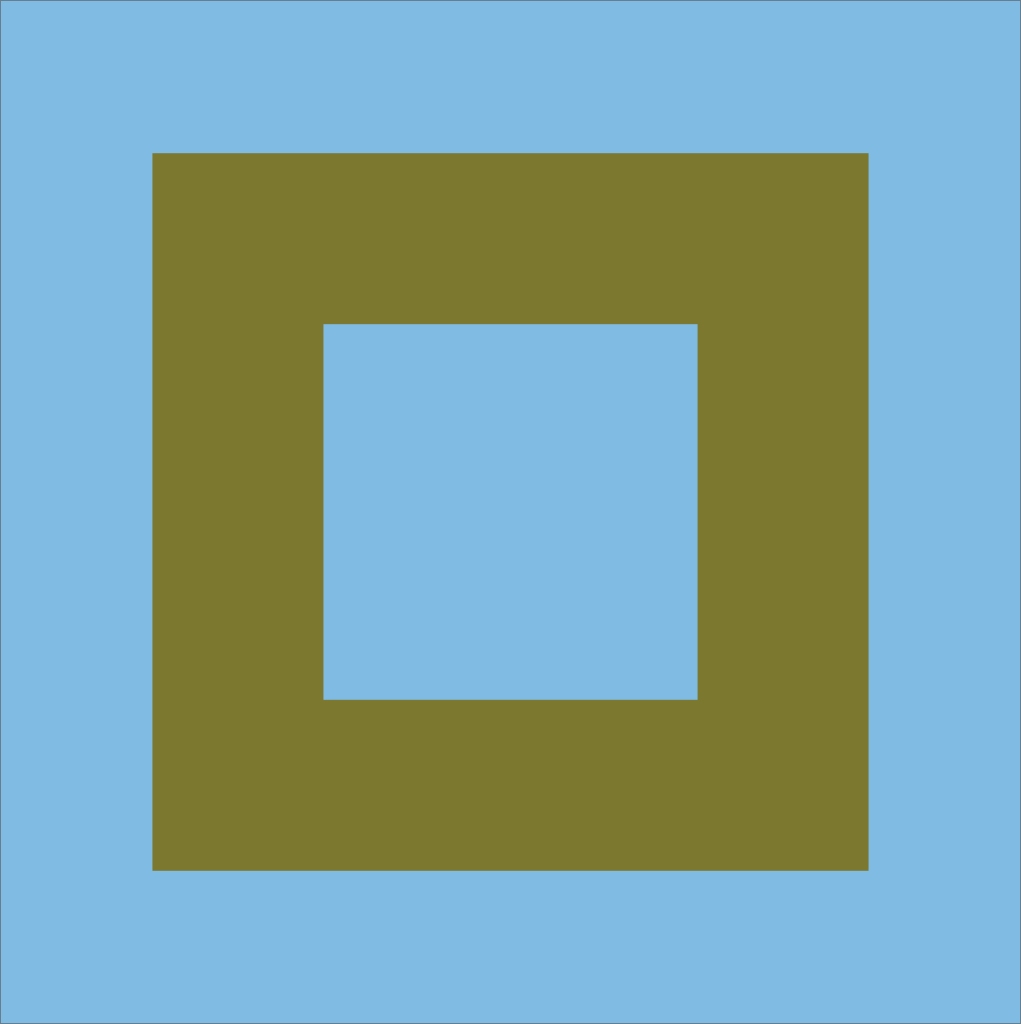
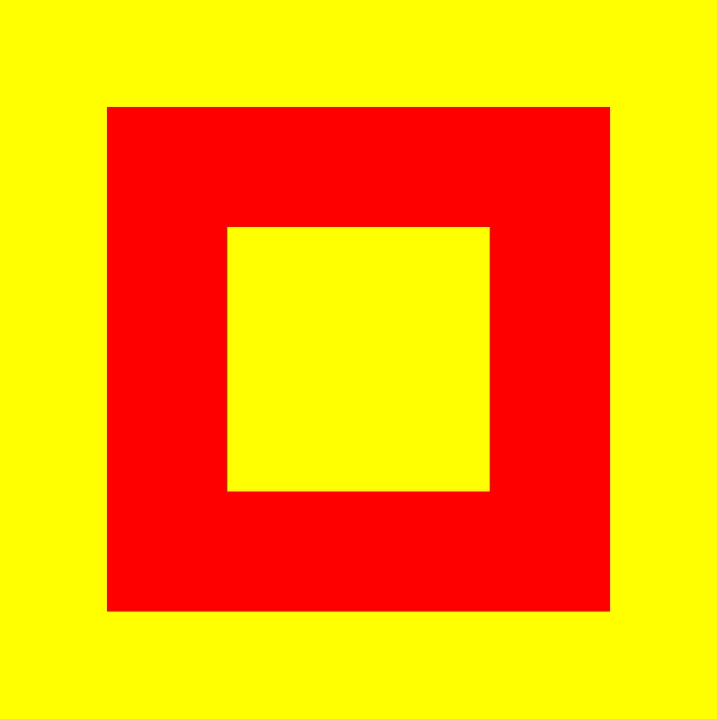
As I look at the design, I imagine the day I had, the bright sky but as the sun is getting lower the vegetation starts to darken in the shade as if it were going to sleep. As I had the image of this in my head, I contemplated on each term and the term ‘quiet’ felt most suitable as when the sun goes down, the night becomes quiet and peaceful.
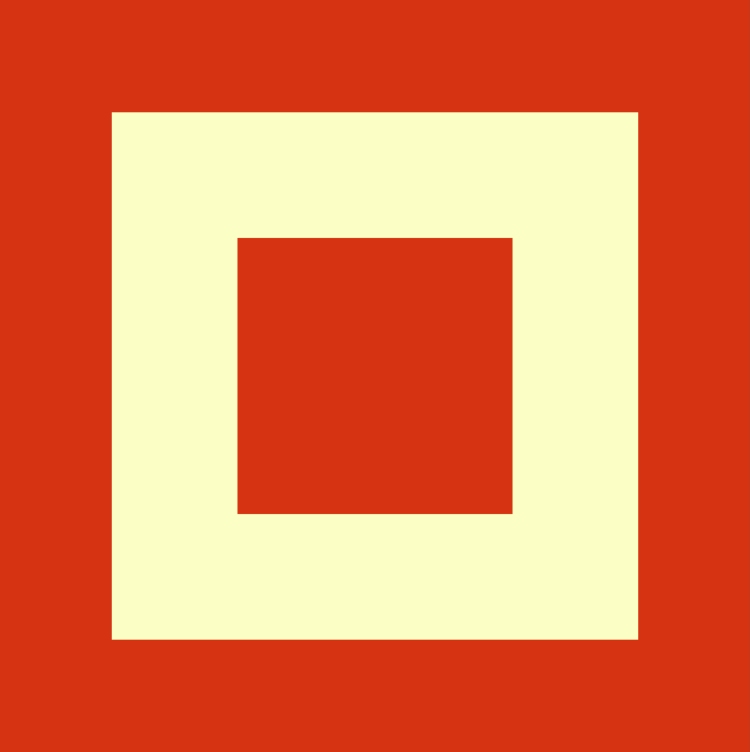
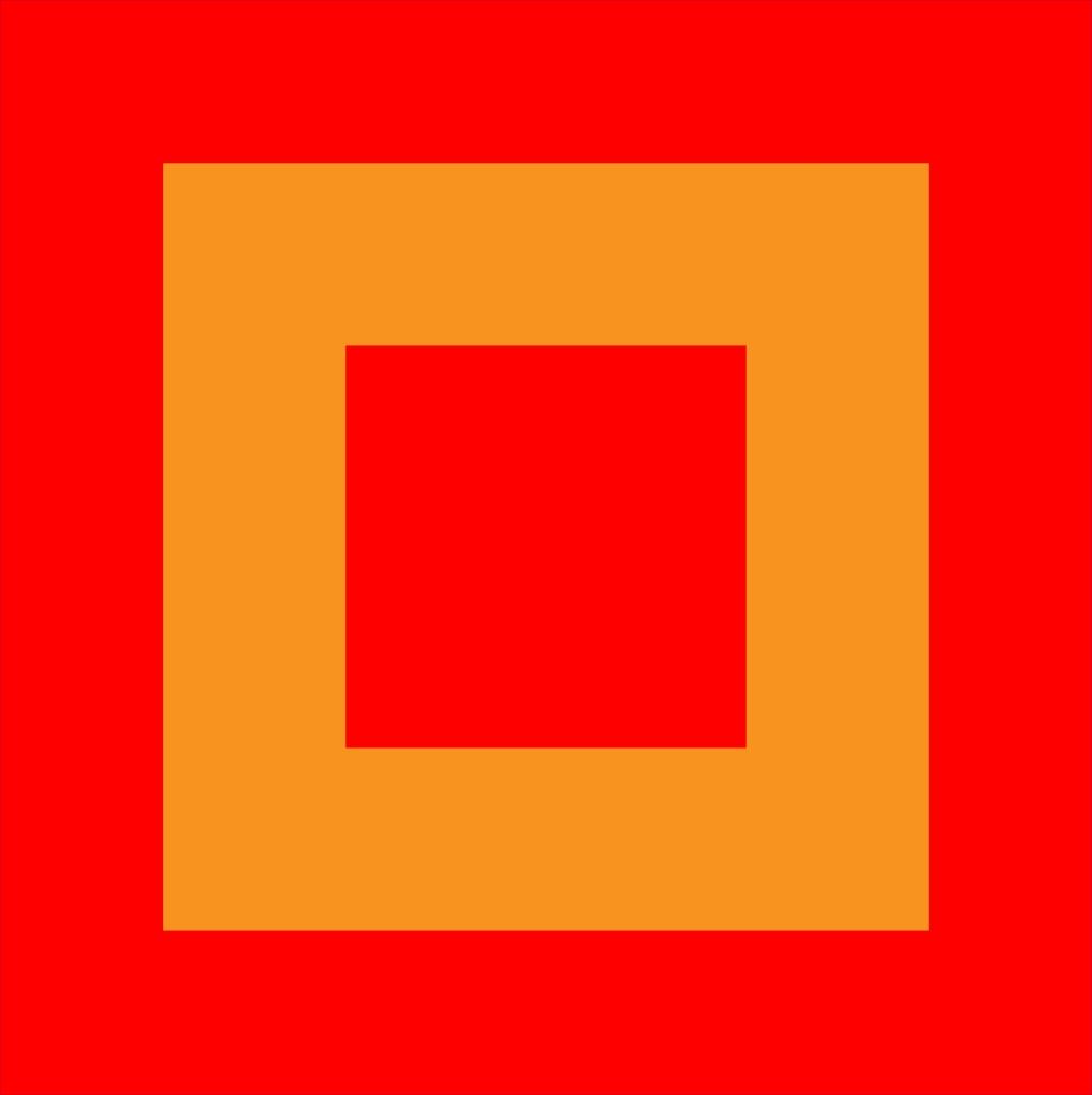
I wanted to add another set of colours based on my day of observing the world around me. I thought about a moment I drove down a hill and there was dark smoke blowing across the road from an industrial park, and behind it was the sun. The contrast of colours was quite pleasing to the eye and calming as the sun peeked through the smoke, but the smoke itself and on its own would have been gloomy and not so appealing because of its toxic dark grey colour. Below I placed both grids next to each other to see how they look.

My second set of colours would be most suited to the term ‘masculinity’. I chose this term because of how the setting I experienced made me feel, the dark smoke coming across the road made me feel strong and masculine because of dangerous nature of the smoke, but then the yellow made me feel humble and happy. The same way anyone would feel looking into the sun.
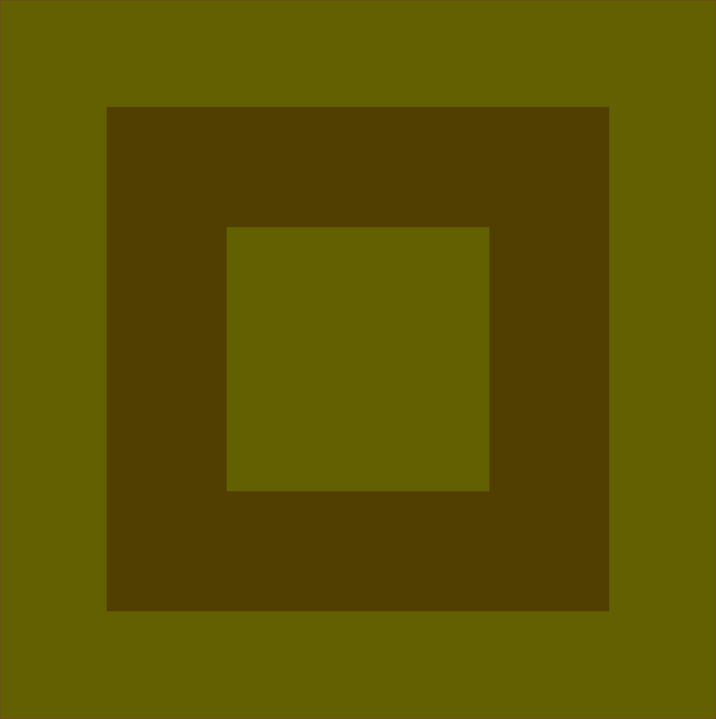
Next, I took the 2 colours I like the most and put them into one grid and put the colours I dislike into another and this is what they look like next to each other.

After this experiment, I realised that it is true. The colours we think we like the most when put together almost look garish and too bright, but the colours we don’t think we like when put together look nice and subtle.
Next, I had a think of other colours that I didn’t like and colours I did like:
Colours I like
- Grey
- Lavender
Colours I dislike
- Mud brown
- Seaweed green
Now with these colours, I decided to find the colours online and copy them over to Illustrator so I could make a swatch palette.
To do this I used Adobe Color(3)
I love this software that I get with my adobe package. I can easily explore different search terms and 100s of example images show up and each image includes the colour palette used. When I find a colour palette I like the most, I simply click on it and choose the option ‘save to library’ and the colour palette is saved straight into my Illustrator libraries.
Next, I opened up Illustrator to put the colours I want to use for my grids into its own library and ready to use.
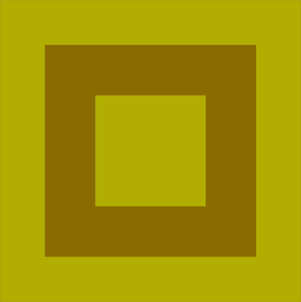
So here is the final grid. The colours on the left are colours I like and the colours on the left are the colours I dislike. Funnily enough the colours I dislike probably go together better than the ones I like. The colours I thought were my favourite, look garish and lurid, but on the right, I see a more subtle array of colour.

This was a nice warm-up to the exercise and next, I moved on to find colours for the rest of the terms given in the brief. Before diving into the rest of the terms I decided to look up Johannes Itten for inspiration and see more of his designs. I was blown away by the amazing array of colours in each of his designs.

I feel like Itten uses pretty much the whole colour wheel in some of his art pieces. I can tell Itten was going deep into the theory of colour and after finding an article on the OCA website about colour theory, it was clear to me that he likes to mix a lot of primary colours, secondary colours, complementary colours, contrasting colours, similar colours, accented colours and different tones(7).
Angry
To come to the conclusion of this colour I had a think of what I know that is angry. A fire is angry, the way it burns uncontrollable, especially wildfires that can’t be stopped without drastic measures.

To get this colour and colours for all of my other grids I will copy the images into Illustrator and use the eyedropper tool to grab each colour for my grid.
Bravery
When I think bravery, I think Superman. I grew up watching Superman and like all other teenage kids, he made us feel strong, confident and brave.

Again, I created my own colour swatch by creating 2 separate shapes and using the eye dropper tool to fill them with colours from the Superman image. See below for example.

And this is what I came up with.

Creative
When I think about this term I think about everything that inspires ideas, and where ideas come from. I imagined a cartoon where a character gets a bright idea and a light bulb flashes above their head. I decided to find the image of a lightbulb from the internet but this time, I wanted to see if there was a quicker and easier way to extract colours from an image so I researched the web and came across a tutorial(4) that taught me how to import an image and automatically receive a colour pallette for that image. See screengrab below –

I saved this colour pallette to my libraries and it appeared in Illustrator in that split second and I was able to change the colours of my grid in seconds. This way is a lot quicker and smoother.
So here is my colour grid for creative –

Dangerous
I thought of a dangerous animal and Hyenas came to mind.

Energetic
For energetic, I image a human friend and what they would wear and I can visualise them wearing a mixture of bright, happy and joyful colours.

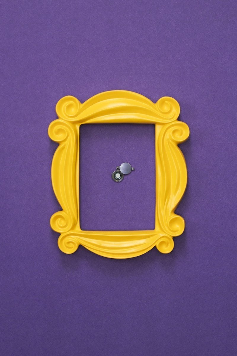
Familiar
I decided to find the definition of ‘familiar’ online and on Google, they describe the term as “in close friendship; intimate.”(5). So I had a think about what tv programme or cartoon showcases close friends and the tv show ‘Friends’ came to mind so I decided to grab colours from the famous ‘Friends’ door.
Gregarious
Again for this term, I decided to find the definition on Google – “(of a person) fond of company; sociable.”(6). I needed to come up with colours for the term ‘sociable’ so I had a think of another animal but tends to be sociable and Dolphins came to mind because they always swim in pods.

Hopeful
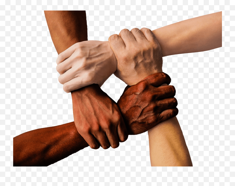
Hopeful is a word to describe someone who is feeling optimistic about a future event. To get colours for this image, I imaged people holding hands, hoping for a miracle.

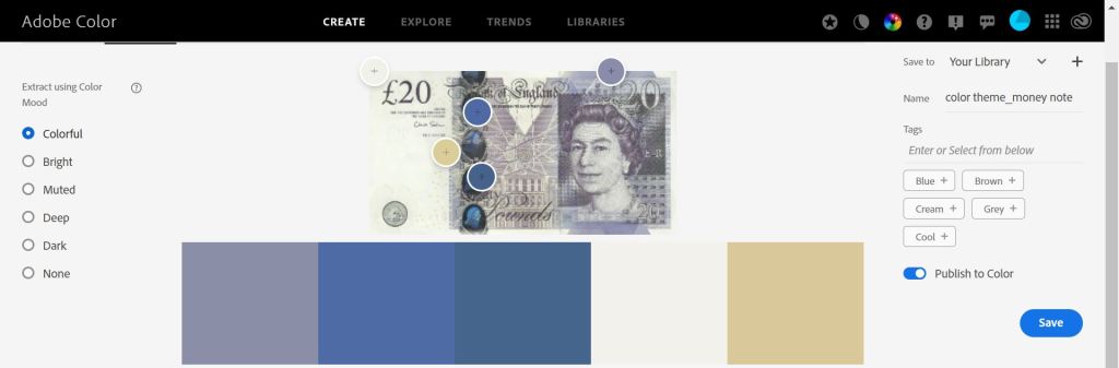
Independant
For this term, I thought back to when I myself became independent for this first time. I thought back to when I got my first full-time job, worked a month and got my first full pay straight into my bank. I remember how amazing it was to feel independent and to be making my own money. For this image, I decided to use a money note for my reference colours as money was my first taste of independence.

Jumpy
To decide what colours to use for this image, I had a think about what animals I know that jump, and straight away Kangaroos came to mind. I spent 2 years in Australia and loved seeing them jumping everywhere. I could also use a green colour that represents a frog, another jumpy fella. Maybe I will use 1 colour for a kangaroo and the other colour for a frog for a nice contrasting image.
Kinetic
The definition for ‘Kinetic’ is “relating to or resulting from motion.”(8). For this term, I wanted to try something different. I wanted to try and make the colours look like they are almost in motion and to achieve this I chose 2 colours that are similar in brightness and turned up the saturation to give the merging edges a blurred effect. I learnt this after reading an article on vibrating colours.(9)

Luxurious
When I think luxurious I think gold and silver. I wanted to attempt another vibrating colour image so I chose silver and gold and turned up the brightness to make them appear to be vibrating.

Masculine
(See intro for masculine).
As I started to see a bit of repetition in my colour grids, I decided to find a colour wheel and start experimenting with different colour theory combinations such as primary, secondary and complementary.

“Primary
The basic three primary colours are red, blue and yellow.
Secondary colours
A secondary colour is a mixture of its two adjacent primary colours in the colour wheel. For example, blue and yellow produce green.
Complimentary
A combination of complementary colours is produced from the relationship between a primary colour and the secondary colour in the wheel, which is in a diametrically opposed position to it. In theory, but not in practice, the mixing of two complementary colours should produce a completely neutral result in the right proportions hence the name, complementary.” (10)
So for the next few terms, I wanted to come up with different combinations using only primary colours for these images. Primary colours are made up of red, blue and yellow so I went ahead and created a swatch group for these colours on Illustrator.
New
Open
Precious
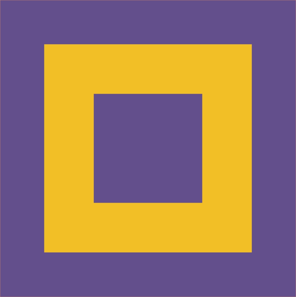
Next, I had a look at secondary colours on the colour wheel and created another swatch group. The colours that I added were green, orange and purple. I already created an image for quiet right at the start of this exercise but I wanted to create another one based on secondary colours.
Quiet

Reasonable

Moving on, for the next image, I created a swatch based on complementary colours from the colour chart.
Sociable
Next I decided I wanted to create bright images and put them next to dark images to see the contrast.
Tasteful

Unhappy

Vital

Wonderful

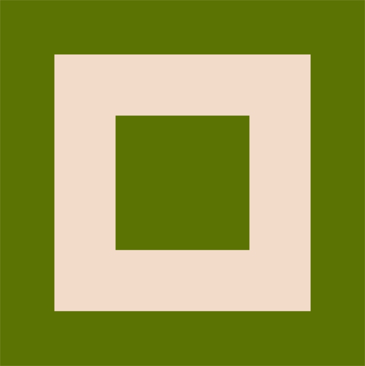
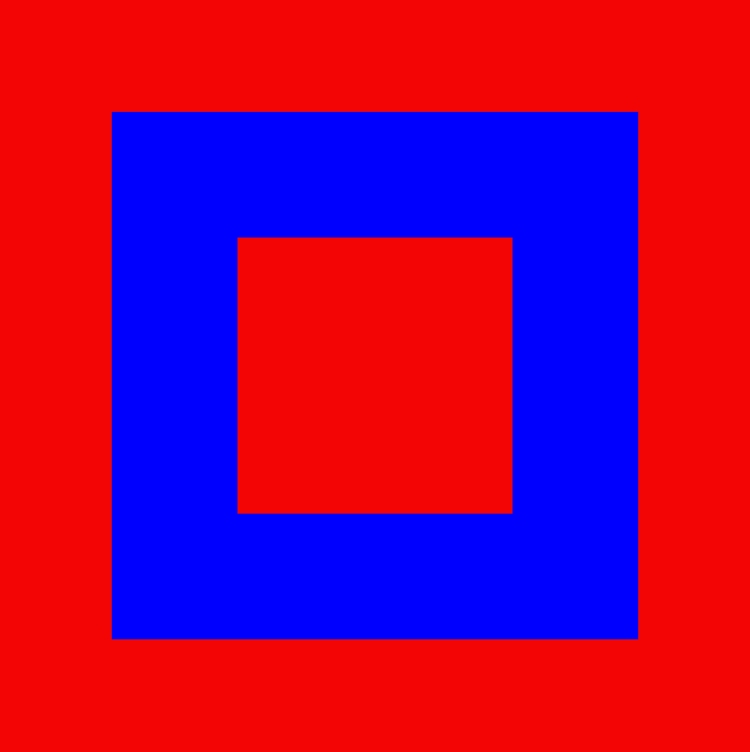
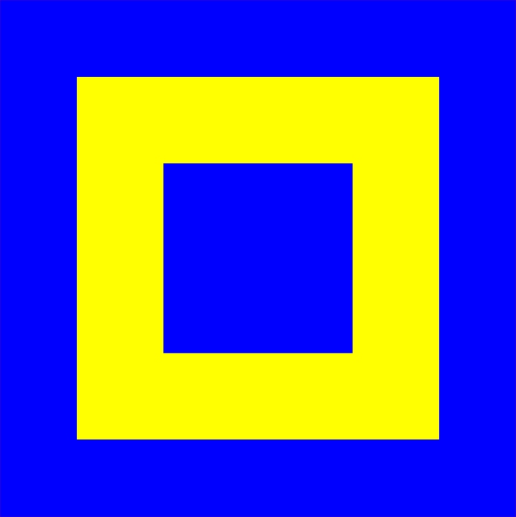
Next, for the last 3 terms I wanted to use the same 2 colours but for each image change the brightness and saturation because I thought it would be interesting to see the contrast between images of the same colour.
Extra special
Youthful
Zany

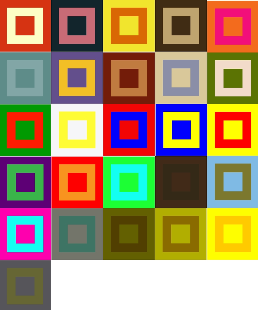
All together
Reflection
For this exercise, I started out by trying to understand colour theory and what different parts of the colour wheel stood for. After researching the web for information on the colour wheel I began to understand more the terms used such as the primary colours, secondary colours and complementary colours. I wanted to take what I learnt and put it into action so I experimented with several grids and realised that by understanding the colour wheel, that I could take certain colours and when put together actually look really pleasing to the eye. If I didn’t understand the colour wheel I may have put two colours together that wouldn’t really be that pleasing if used in a poster, for example, if I used 2 neighbouring colours, I wouldn’t get as good of a contrast then using complementary colours, i.e colours opposite to each other on the wheel. This isn’t always a bad thing, just depends on the desired outcome for a design but through this exercise, I have learnt what types of colours go best together without looking garish or appearing to be vibrating.
By taking colours I like and colours I dislike and putting them next to each other in grids showed me that in fact the colours I thought I disliked typically look better because of their subtleness, whereas the bright colours we would typically go for, look quite garish when put together.
At first, I didn’t have a clue what colours would represent each term given in the brief. I was given 26 words, each starting with a letter from the alphabet, and I was to create a grid of 2 colours that represented that term. In total, I would choose 52 colours. I researched how many colours there actually are and I found out there are only 11 main colours. I mean “the human eye can see 7,000,000 colours”(11) but are all these made up from the 11 main colours but different shades, tones and saturation?. Quite amazing to think actually, that so many colours are made up from only 11.
So for the first several terms, I had a think about what colour represents them. So I used my own knowledge to think of colours I could use, searched for images online and pasted them onto my artboard, I then used created 2 shapes and used the eyedropper tool to grab colours from the image and filled the shapes accordingly, but later I found a much quicker and easier way to import the colours straight into my library. I simply saved the image from google, imported it into Adobe colour and after Adobe works it’s magic, a whole pallet of colours are created using the colours from the image. Then I simply select ‘save to library’ and they are accessible immediately in my Illustrator library.
I started to struggle to find colours that represent each term so I took another approach and attempted to use combinations of colours using primary, secondary and complementary. I wanted to experiment with what I learnt while researching the colour theory so I went ahead and created different swatches based on primary, secondary and complementary colours. I continued to experiment with different colour combinations and found that the colours I had randomly chosen for each term actually represented them really well. For example a dark brown and dark green image for unhappy and bright green and light blue for tasteful. This realisation blew me away because at first, I was struggling to find colours to represent each term but after choosing random colour combinations, I realised that colours can represent almost anything depending on their tone, shade, saturation and brightness. For example, I could take ‘unhappy’, lighten up the brown and brighten the green and use it for the term tasteful. I experimented on this further by creating three images using the same colours but changed the brightness on each and put them together to find they go nicely together and create a nice contrast.
I enjoyed this exercise even though I struggled at the start. I found momentum and in the end had better knowledge on how to understand the colour wheel and what colours go best with other colours and what don’t, for example, the images I created with 2 bright colours created a blurring effect, not so pleasing if used side by side in a poster. These types of colours together make me feel dizzy and sick when I look at them ( see kinetic and luxurious ).
At the end I put all the images next to each other and I was amazed how well they looked next to each other creating a beautiful contrast and combinations of colours.
Going forward I will continue to use the colour theory in each of my designs as when used correctly can make a design stand above the rest.
Bibliography
https://www.oca-student.com/resource-type/online-guide-elements/colour-theory-and-relationships
Design Notes & Research
- Define tertiary
- “Third in order or level” (1)
- Define Dynamic
- “Dynamic Relationships is a call to change the way we live and work together. It is an invitation to develop a new set of beliefs for how you perceive and make sense of the world. It is also intended as a guide for a new way for all of us to make meaning together.” (2)
- Adobe Colour (3)
- Adobe Colour – Extract colours from image (4)
- Define familiar (5)
- Define Gregarious (6)
- Johannes Itten (7)
- Kinetic (8)
- Vibrating colours (9)
- Colour theory (10)
- 7,000,000 colours (11)
