Brief
Analyse The Brief
Requirements
– short and long-tail keywords
– What do I think I am being asked to do?
– Communication issues, design problems and other concerns
– How will the client judge a successful outcome to the brief?
Researching And Developing Ideas
Visualizing Ideas
– Sketchbook
Final Design
– Method
Evaluation
Critique
Notes On Critique
Bibliography
Brief:
“This assignment draws on what you have learnt through the projects and exercises so far,
working with visual dynamics, colour, collage and visual language”
“To produce a poster (297mm x 420mm) that celebrates a colour of your choice.
Choose a colour that has a meaning that you want to explore and celebrate. Think about
what the colour you have chosen means both to you and to other people and create
something that celebrates that meaning, for example, you may choose a golden brown
because you like real ale, a vivid green because of a particular landscape, green to celebrate
Irish identity or the yellow sandstone of Bath’s architecture..”
“You need to submit at least three variations of your poster as well as the finished artwork.”
Analyse The Brief
Requirements
- Work only with my chosen colour, it’s complimentary colour and black and white
- Can include text, collages, illustrations and photographs
- Use black and white to help establish a range of tints and shades with my chosen colour
- I need to submit at least three variations of my poster as well as my finished artwork
Short and long-tail keywords
Poster (297mm x 420mm), colour, meaning, explore, celebrate, means, you, other people, complimentary, black, white, text, collages, illustrations, photographs, tints, shades.
What do I think I am being asked to do?
I am being asked to create a 297mm x 420mm poster that celebrates the colour of my choosing. I am to take into consideration what the colour means to other people and I, and portray that in my poster. I get to choose one colour, it’s complimentary colour and to make use of black and white to add tints and shades to my poster. I am to create a poster based on what I have learnt from the course so far and demonstrate this through visual dynamics and meaning.
Communication issues, design problems and other concerns
- What have I learnt so far in the course and how can I add each element to my design?
- What software will I use to create my poster?
- How will I display my final design?
- Who will critique my poster?
- How will I display my work to my critique so they understand the concept in few words or less?
- How will I make sure my poster has a meaning?
- I have to submit at least three posters as well as my final design. What will I do to change the way each design looks but keep the same meaning?
- How will I make use of black and white in my designs to add tints and shades?
- Who will be my audience?
- How will I organise my files to make sure I stay on top of my work so I can go back and make changes when needed?
- What settings will I use when setting up my artboard to make sure I keep the highest quality when exporting?
- What colour will I choose?
- What is the complementary colour of my chosen colour?
How will the client judge a successful outcome to the brief?
To receive at least three variations and a final design of a poster that celebrates a colour through different visual dynamics such as composition, contrast and hierarchy and that also holds something of meaning to the chosen colour.
Researching And Developing Ideas
Brainstorm
First of all on my assignment journey and before carrying out any kind of research, I wanted to have a clearer vision of what colour I wanted to celebrate. I spent a couple of days contemplating the brief and thought about what subjects interest me and what meaning I could portray through the language of my design. I also thought about subjects that I have learnt during this course and knew I wanted to demonstrate what new knowledge I have developed. I created a spider diagram to brainstorm what subjects I have covered during the course and what skills I have developed and can use for my assignment.
(add diagram)
So what scene could I create in my design that would showcase all that I have learnt?
I really enjoyed the exercise ‘Seeing The Light’(1) as I got to experiment with different visual dynamics such as composition, hierarchy, contrast and depth and I also thoroughly enjoyed the exercise ‘Abstract Cities’(2) as I got to learn about visual dynamics in colour, such as subordinate, dominant and accent.
I then thought about what I could design to bring these design elements together and because I am a very visual person, I let my imagination go wild and removed all barriers and judgement to see what images I could create in my mind’s eye. I decided to contemplate on my favourite colour green and the complementary colour red and visualised a landscape scene filled with green rolling hills, leaves from a tree, bushes and to add an element of depth I could add a house on one of the hills. The house could be the hierarchy of the design and portray the message of ‘home’ which anybody can relate to and feel passionate about. I also wondered about creating the same scene but celebrating the colour blue and turning my design into a winter theme, this way my design would be the same but testing two different colours could change the meaning. After researching the colour green, I found out that this colour represents tranquillity, safety, good luck and health(4) and the colour blue represents calm, confident and secure(5). In my head, I wanted to use the colour green as a happy, cheerful day in the countryside and the colour blue as a cold winters night. The brief mentions creating 3 posters as well as my final design so I knew I had a chance to experiment with different colours and compositions.
I thought the best way to celebrate the colour green would be nature and to reach this idea, creating a travel style poster would be the best way to go. People love nature and especially with our current climate and covid restrictions, we are unable to travel, so If I could create a poster that represents our amazing world in nature and the fact this planet is our home and we should cherish every moment and be grateful for what we have around us. This is the meaning I wanted to portray in my poster.
Visual Dynamics
During my journey through this course, I wanted to delve deeper into the understanding of colour and composition so I enrolled in a 4-hour course(6) that is teaching me the advantages of composition, light, colour and how to create story-driven illustrations. Below are a few important composition factors I learnt and attempted to use in my posters.
Rule Of Thirds

I have learnt that to add a beautiful composition to any design, is to follow the rule of thirds where the main points are to be situated on those lines as seen below in an example I found online.
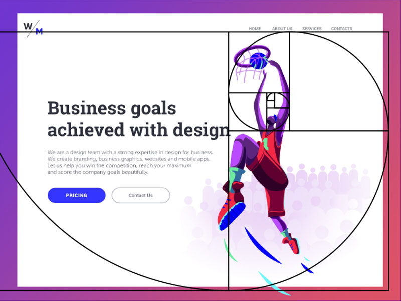
Golden Ratio
I found the golden ratio to be effective in not only graphic design but photography as well. I found out that to make the most appealing design, we have to be very attentive to where we place those elements within the design and I found the golden ratio helps us determine the amount of space needed between each element and helps decide where the hierarchy of the design will be situated.
Leading Lines
Leading lines are used as part of a composition to lead your eye into and around the design and I found that this is a great way to bring a design to life and to improve the language of the design by telling a story.

Colour
So for the colour I wanted to celebrate, I chose green as I was inspired by life around me, in nature and has always been my favourite colour when people ask. To get the right colour palette for my posters I went to the internet to see what caught my eye in other popular travel posters.

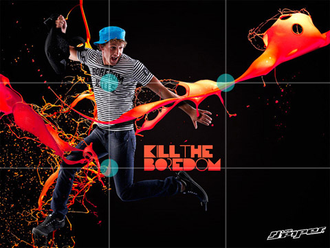
This design is beautiful with the dominant green colour, the dark green colour as the subordinate and a small quantity of orange that represents the accent colour.
As an example to demonstrate what I have learnt during Core Concepts, below is a description of how I have developed the ability to create a colour palette from any image using Adobe Colour to extract the colours from the image and import them into Adobe. I find this the easiest way to grab colours from an image I think has a nice colour theme and import them to Photoshop or Illustrator to then make a swatch out of the colours.


I also love Adobe Colour for it’s explore feature, for example, I could enter green into search and 100s of already made palettes that other people have made show up right in front of me, sometimes showing the image where the colours were pulled from. The palettes give you ready to use colour swatches with harmonious and well contrasting colours. See below.

At this point, I was starting to build a picture in my mind of what I wanted to design and how I could utilise the above dynamics so I made a mood board as I thought it would be better to get down what was in my mind.

https://www.flickr.com/photos/cinnamonmuse/15599712965?epik=dj0yJnU9c3pvVEJfTTJZeWFoSE5YYWtSZ294QW9YYmJINVhxcWImcD0wJm49NnVRTDVacmJoLWdpRzZLbTFUd1VLQSZ0PUFBQUFBR0FZYTlB
https://www.pinterest.co.uk/pin/825425437952527535/
https://www.pinterest.co.uk/pin/825425437952527559/
https://www.pinterest.co.uk/pin/825425437952528658/
I like the rolling hills on the middle image at the top but really like the depth and composition of the bottom right image as the house is clearly the focal point and this is what I wanted to achieve in my design. I feel like the 2 left images don’t really have the composition I was going for but it was a nice contrast for me to see as the other 3 illustrations clearly have well thought out compositions with the rule of thirds and golden ratio whereas the images on the left are quite flat.
Visualizing My Ideas
(add sketches)
IMAGE 1 MONTAGE –
steps –
copy and paste
skew
warp
brush tool, low opacity to create depth
ADD TREES CHANGE SIZE FOR DEPTH
https://pixabay.com/photos/hill-lonely-tree-green-meadow-421569/
http://www.myworldshots.com/authors/Romsan/Red-house-on-the-hill-11519.html
https://pixabay.com/photos/girl-boy-woman-man-couple-3288623/
https://pixabay.com/photos/road-coast-cliff-sunset-mountains-5904909/
https://freepngimg.com/png/6706-tree-png-image
PIC 2 –
STEPS –
pen tool
used green and started with the light colour I darkened it
pic 3 –

spiderdiagram – go through course exercises and jot down notes
whay have a learnt
how can i put it into practise
software?
theme of design?
Visualizing My Ideas
Sketchbook
Final Design
Method
Evaluation
Critique
Notes on critique
Bibliography
Brief:
To produce a poster (297mm x 420mm) that celebrates a colour of your choice.
Choose a colour that has a meaning that you want to explore and celebrate. Think about
what the colour you have chosen means both to you and to other people and create
something that celebrates that meaning, for example you may choose a golden brown
because you like real ale, a vivid green because of a particular landscape, green to celebrate
Irish identity or the yellow sandstone of Bath’s architecture..
Requirements
Analyse The Brief
Short and long-tail keywords
What do I think I am being asked to do?
Communication issues, design problems and other concerns
How will the client judge a successful outcome to the brief?
Researching And Developing Ideas
Visualizing My Ideas
Sketchbook
Final Design
Method
Evaluation
Critique
Notes on critique
Bibliography
(1) Seeing The Light Exercise
(2) Abstract Cities
(3) Digital Painting for 2D Illustration/ composition
(4) Meaning Of Green
(5) Meaning Of Blue
(6) Story-driven illustration
